Who has the best Zoom background? Interior designers rate the Senate Blue Ribbon Committee (virtual) hearings
The Senate Blue Ribbon Committee held a hearing Sept. 14 on the DOH’s COVID-19 expenditures and the COA report on Pharmally, an unknown company awarded billions of pesos in government contracts during the pandemic.
Led by committee chair Richard Gordon, the hearings yesterday and Sept. 7 were attended by senators and resource persons invited for questioning via Zoom.
While they discussed issues of national importance and alleged corruption in the procurement of COVID-related supplies, viewers on the Senate’s Facebook page during the Zoom livestream were also watching a side story: the senators’ rooms and backgrounds.
Like the popular Twitter page Room Rater, we’re rating the Zoom backgrounds of the Senate Blue Ribbon Committee members and the people they were interrogating.

For this fun undertaking, we asked three of the country’s top interior designers to help us rate their rooms: Chat Fores, Ivy Almario, and Ito Kish. Their eye for detail is amazing—and so is their sense of humor.
On a scale of 10—with 10 being a great room and background, distance to the camera, lighting and setup—here’s what our designer friends have to say.
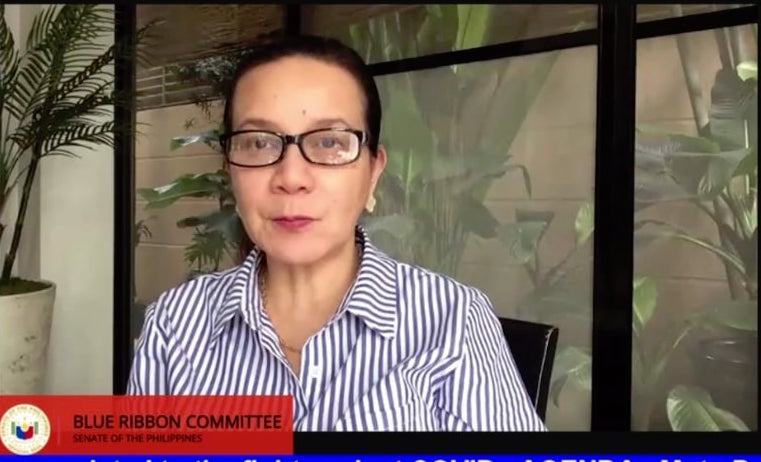
Grace Poe

Ivy Almario: 9.5/10
Is that a garden at the back of the huge French window? This ties with the other 9.5 scores only because it’s an intriguing background. It skews scale and sense of place, engaging my imagination. That’s how the points stacked up.
Ito Kish: 7/10
Nice except for the blinds.
Chat Fores:
Proportion and scale of plants are spot on. Maybe I’d add some color like blue and white planters.
Ralph Recto

Chat Fores:
Love the touch of Ate Vi’s pretty portrait at the back. Natural light is good but he needs to soften it a bit, add some translucent curtains.
Ivy Almario: 7/10 or 9/10, depends on how you feel about Ate Vi
Dear Senator Ralph, must wifey’s portrait be there—is it a photo or a charcoal drawing? Would have been touching if it did not feel contrived. If it’s not contrived, then good for you! I may concede a point. So as a 9, you vie with Senator Pangilinan, who escaped a similar brouhaha by going the route of a well-designed graphic background with not even a watermark of Shawee!
Ito Kish: 8/10
Because I’m a Vilmanian!
Imee Marcos

Ivy Almario: 9.5/10
The bookcase with the casually arranged books and knick-knacks is a refreshing break from the typical decorative lamp and artwork over a console background. Very even lighting means she invested in several ring lights to give her skin tone perfect rendition. She missed the perfect score by .5 with the two very symmetrical plants that flanked her. I would have loved to see a little asymmetry here, be it in plant species or shape!
Ito Kish: 7/10
She oiled her rubber plants. Those stuffed toys!
Frank Drilon

Ito Kish: 5/10
The more expansive the shot, the more unnecessary things you notice.
Ivy Almario: 8/10
Nice salmon color on the walls, perfect foil for your heirloom pieces. Pity you’re too far from your background for us to enjoy the vignettes.
Francis Pangilinan

Ito Kish: 9/10
He is prepared, clean, and easy to look at.
Ivy Almario: 9/10
Perfect choice for a wallpaper. The blue with that touch of red works so well with the Seal of the Republic of the Philippines. This background serves him well, especially if he continues to wear his signature white polo barongs. The brilliance is in choosing a wall paper background that works. No interiors to comment on.
Tito Sotto

Ivy Almario: 6/10
Sad. No attempt to even have a background. Even with the seal and the flag, this whole vignette falls on its face. It’s a generic-looking office of a civil servant.
Chat Fores:
Need to add more picture frames and maybe more décor. A big painting on the right would be an element to play with the balance of the background.
Ito Kish: 5/10
No comment.
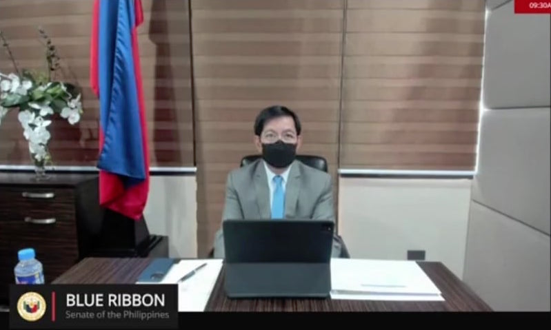
Ping Lacson

Ivy Almario: 8.5 or 9/10 with Photoshop
Oy vey! So lopsided naman. Please, please Photoshop a healthy, strapping indoor tree on the right side of the image. But the desk is neat. He’s dressed well; his combi roller, even if it’s closed, does not fight with the upholstered walls. All told an 8.5 or 9 with a Photoshopped tree!
Chat Fores:
I’m getting OC with his window treatment—I want to pull up the center panel. The furniture pieces are too monotonous. Can be improved with some pops of color or a diff desktop material. Some natural light would be nice.
Risa Hontiveros

Ito Kish: 8.5/10
Love the symmetry and styling.
Ivy Almario: 8/10
If she had moved a tad, the artwork would have been seen. That whole vignette of nice lamp, artwork and plants would have been appreciated. A miss! Her being in the middle when she could have been at an angle cost her two points.
Richard Gordon

Ivy Almario: -5/10
Neutrals, nothing to write home about. There is no focal element.
Ito Kish: 6/10
I wish he centered his camera more so that the column behind it is hidden away.
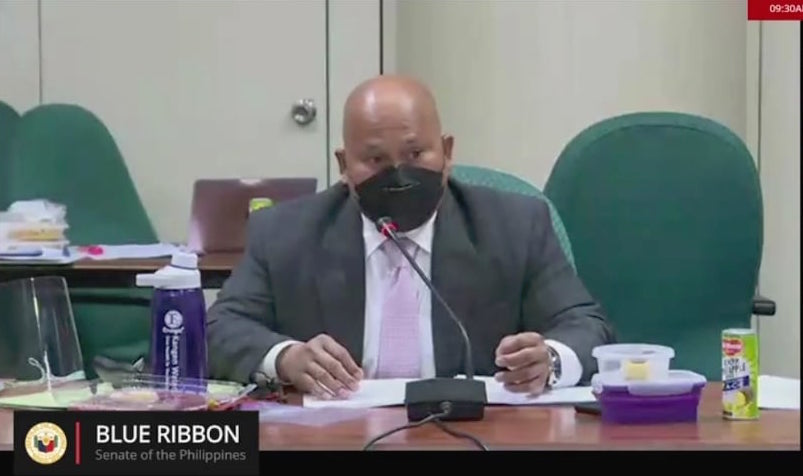
Bato dela Rosa

Ito Kish: 6/10
No one decided to show up at the workspace.
Ivy Almario:
Seriously? Is he the 3rd Mountain?
Francisco Duque

Ivy Almario:
He ties with Bato. Bottom feeder. He just blurred a boring ceiling.
Ito Kish:
Conserve energy!
Gen. Carlito Galvez

Ivy Almario: 8.5/10
Balanced. Symmetrical flags. Distance of face to camera is good. The framed memorabilia’s colors blend well with everything that’s going on.
Ito Kish: 8.5/10
Love the symmetry, and it looks very well thought out.
Ferdinand Ferrer

Ito Kish: 6/10
The composition screams “at work in the office.”
Ivy Almario: 8.5/10
As a composition, this works. His blue shirt, against the stain of the timber panels. The camera angle is forgiving. Even if in real life the artwork may be hung too high; as it is captured through the camera, as a composition, it works.


