#TravelThrowback: Philippine tourism slogans and campaigns through the years
Slogans play a large part in promoting a travel destination and attracting tourists not only within the country, but all over the world.
Just think of "Incredible India," "Amazing Thailand," and "Malaysia, Truly Asia." These slogans immediately bring images of the destinations to mind. Some country’s tourism slogans are just so timeless and have great recall value that tourists know exactly what to expect.
For the past 10 years, the Philippines has been using “It’s More Fun in the Philippines” as its main tourism slogan. But with a new administration in place this year, the campaign could soon change.
In a report by PhilStar.com earlier this month, current Tourism Secretary Christina Frasco said that the Department of Tourism (DOT) was considering replacing the slogan with a new one anchored on making the Filipino brand more “distinct.”
The tourism chief said the new branding campaign will “take into consideration the change in circumstances, citing that amid the COVID-19 pandemic, people are now in search for substantial and immersive experiences anchored on cultural experience.”
While the tourism agency is still brewing up a new campaign, since travel borders are reeopning, now seems like a good time to take a look back at some of the hits and misses in tourism marketing of the Philippines.
The country has had its fair share of different promotional slogans through the years. A Wall Street Journal article published in 2001 pointed out that for years, the country struggled to find a catchy slogan. The report cited campaigns in the past including "Philippines: Where Asia Wears A Smile," "Fiesta Islands Philippines," "Rediscovery Philippines" and the almost-apologetic "Consider the Philippines."
In an official proclamation, then-president Cory Aquino declared 1989 as the Philippine Fiesta Year. A national council was also created to promote the country as the Fiesta Islands of 1989.
However, it was two decades ago when one of the most memorable slogans in local tourism was born.
WOW Philippines (2002)
WOW Philippines was used as the campaign and tagline for tourism from 2002 to 2010. The tagline, which had the sub-slogan "More Than the Usual” was conceptualized by then Department of Tourism secretary Richard "Dick" Gordon in 2002 under the term of Gloria Macapagal-Arroyo.
The promotional campaign was reportedly based on the 24-month Visit Philippines 2003 campaign by the World Tourism Organization, which aimed to encourage overseas Filipinos to visit tourism destinations in their home country. The slogan was also an attempt to rebrand the Philippines to highlight tropical white-sand beaches and diverse attractions to counter the country's negative portrayal in the media due to political instability and conflicts during those times.

The logo, which used mainly primary colors of red and blue, incorporated unique elements of Philippine culture including a jeepney and festival mask, as well as a sun, coconut tree, diver and boat to reflect the tropical beaches and landscapes.
WOW actually doubled as an acronym, referring to several different aspects about Philippine travel including “Wealth of Wonders” (tourist attractions), “Warm Over Winter” (beaches), “Wild Over Water”(water-based adventures), and “Wacko Over Wildlife” (for the country’s rich indigenous flora and fauna), among others.
The WOW Philippines campaign was considered highly successful and managed to put the Philippines on the world tourism map for the first time. Incidentally, the former tourism secretary also used "WOW Dick" as his campaign slogan when he ran for senator, banking on the campaign's popuilarity.
Pilipinas Kay Ganda (2010)
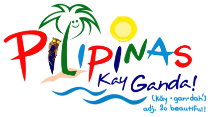
Pilipinas Kay Ganda (which literally translates to "Philippines, So Beautiful") was a short-lived campaign launched by DOT back in 2010 which (thankfully) failed to take off. Initially aimed to replace the WOW Philippines campaign, the logo and branding used similar colors and elements as the former logo including a sun and coconut tree (with a smiling face), a tarsier, and wavy lines to signify the beach and tropical island vibe.

Unfortunately, the slogan and associated logo received a lot of flak from the Filipino public when it was first released, prematurely to the public, according to the advertising agency Campaigns & Grey, which supervised the design. A controversy arose because the logo bore a similar look to the logo of the Polish tourism campaign, Polska in terms of style, colors and font design used.
The widespread criticism led to the eventual scrapping of the new slogan by no less than President Benigno “Noynoy” Aquino III and the resignation of the country's then-Tourism Secretary, Alberto Lim.
It’s More Fun in the Philippines (2012)
In 2012, the DOT started a brand new campaign that aimed to brand the Philippines as the perfect destination for beach bums and dive lovers. The slogan "It's More Fun in the Philippines" was conceptualized with the help of BBDO Guerrero and Proximity Philippines under then Tourism Secretary Ramon Jimenez Jr., an advertising executive.

The punchy slogan aimed to show what sets the country apart from others in terms of the “fun factor” and entice foreign visitors to visit our shores. The colorful logo showed recreated the Philippine map in a textile type weave, while the official AVP highlighted the diverse islands, beaches, tourist sites, festivals and food of the country. The visuals, set to fast-paced music, were dynamic and exciting and highlighted the unique aspects and culture of the country that adventurous foreign tourists could look forward to.
The “More Fun” slogan caught on and became wildly popular with Pinoy users submitting their own photos and reasons why the Philippines was "more fun" with the help of an online meme maker. The user-generated ads that channeled the pride of millions of Filipinos managed to gain a lot of traction in promoting the country overseas, resulting in higher tourist arrivals for the country.
The Tourism Promotions Board also collaborated with world renowned artist and Philippine Tourism Ambassador Apl.de.Ap for one of the promotional campaigns.
Under this campaign, from 2011 to 2016, tourist arrivals and revenues almost doubled, and the Philippines improved 20 places in a tourism competitive index among nations.
Experience the Philippines (2016)
In 2016, there were talks that the “It’s More Fun” slogan would be replaced to reflect then President Rodrigo Duterte’s goal to institute reforms in the country.
At one point, former tourism secretary Wanda Teo planned to scrap the campaign in 2017 and replace it with “Experience the Philippines,” a more emotional approach that aimed to tug at the heartstrings of viewers. The minimalist logo retained the monochomatic colors in the Philippines text and a smaller "It's more fun in the Philippines" tagline in a smaller white font right below.

Right in time for Philippine Independence Day, the Department of Tourism launched the TV commercial "Sights" produced by McCann Worldgroup Philippines which featured a Japanese retiree wearing a tourist hat and dark glasses named M. Uchimura touring the different destinations in the Philippines. The ad, which eventually revealed that the retiree was visually-impaired, ended with a voice-over saying, “here, you don’t have to see the sun to discover radiance. You don’t have to see colors to experience vibrance. You don’t have to see smiles to know you are safe.”
At the time, the campaign drew mixed reactions on social media, with many netizens skeptical about promoting the Philippines as a PWD-friendly destination, and pointing out all the negative events happening around the country. Netizens were also quick to draw comparisons to the “Rediscover South Africa” advertisement, which shared a similar concept and plot twist, and criticize the campaign's lack of originality.
It’s More Fun in the Philippines / More Fun Awaits (present)
Bernadette Romulo Puyat decided to retain the “More Fun” campaign when she was appointed DOT chief mid-2018. However, the former logo was given a slight makeover and got refreshed with a custom-made Philippine-inspired font called Barabara, inspired by lettering seen on jeepneys. The Philippine map logo got simplified with just a few lines.

The new design was said to be more “rooted in traditional motifs and colors” while the new logo was inspired by local woven textiles, and is considered as the “core of a fresh graphic identity system” symbolizing the DOT’s fun, contemporary, and more sustainable offerings.
During the pandemic era when travel borders were closed, DOT also launched its "More Fun Awaits" campaign with the same look to promote newly-developed products and packages featuring different activities, experiences, destinations and attractions for tourists to discover and enjoy in the country once it's safe to travel again.

The new ads were notably not as fast-paced and frenetic as the earlier “It’s More Fun” ads, and highlighted mainly the outdoor attractions and safety and health protocols of travel during the new normal.
Which of these tourism slogans is your favorite? Do you think it's time for another tourism campaign makeover now that travel borders everywhere are starting to reopen?


