MAGIC AND MYSTERY AT THE AYALA MUSEUM
Behind-the-Scenes at ‘Splendor: Juan Luna, Painter as Hero’
There is a certain amount of magical thinking—or the weaving together of unrelated events—that goes into every tantalizing exhibit; and that is true for the ongoing show, “Splendor: Juan Luna, Painter as Hero,” presented by the Ayala Museum with the cooperation of León Gallery.
Exhibit designer Gino Gonzales recalls the startling moment he was told that the show would feature just a single painting: “I thought to myself, how are we going to attract people to come see it? Unless you live in Makati or BGC, Ayala Museum is a pilgrimage! I live in Quezon City and I, for one, was not sure if I would endure hours of traffic to see one painting in a white space!”
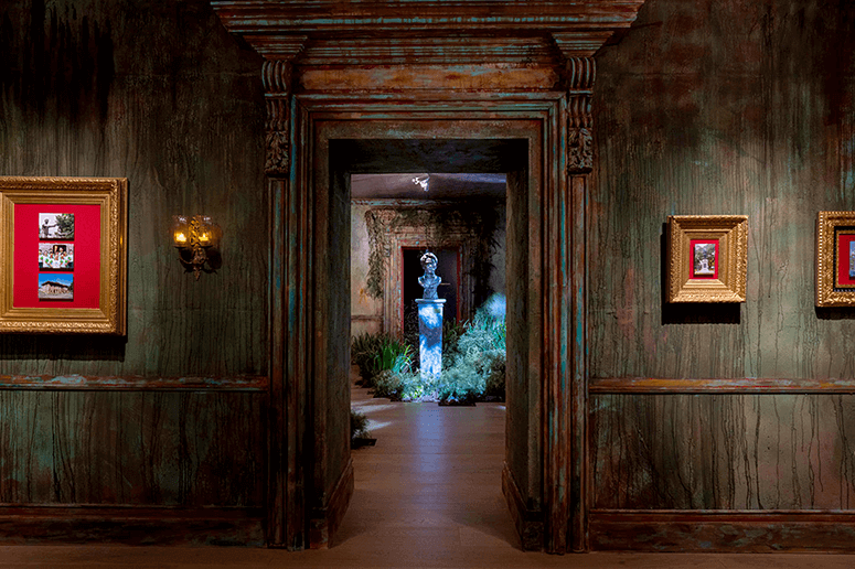
At first, he had no idea what the artwork was because it was all so secret. But when he found out that it was the legendary “Hymen, oh Hymenee,” he reminisced, “It became an even larger task ahead of us: Not only to entice people to come and visit but also to stay—to linger and absorb, and do justice to this wonderful masterpiece.”
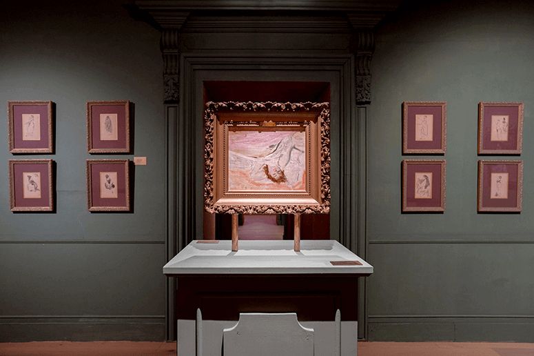
Says Ayala Museum curator Tenten Mina, “Museum-goers today expect to see more than text on a wall. It’s what differentiates museum learning from more traditional academic instruction. Gino’s design built the context of the painting without disrupting the focus on it.”
A sense of mystery and suspense is what collector Jaime Ponce de Leon wanted to impart. “I didn’t want people to walk in and see it right away and then leave. I knew it was a tall order, but I left the ‘how’ to Ayala Museum and all in Gino’s good hands.”
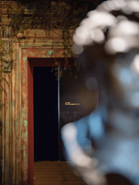
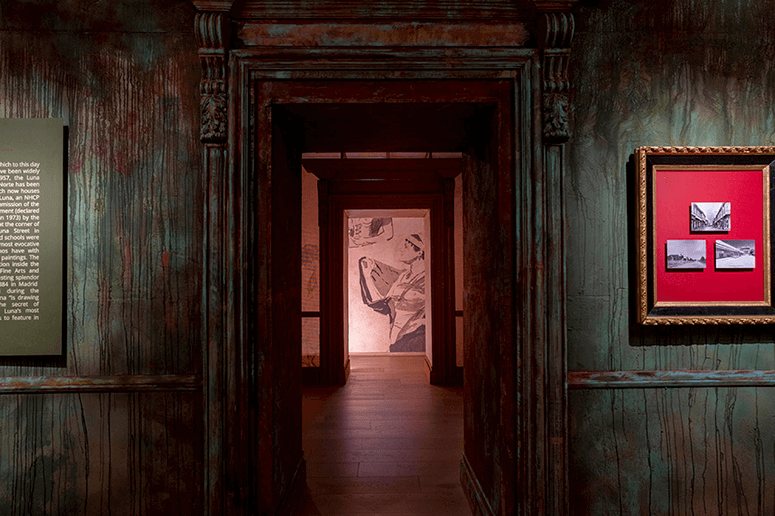
The Eureka moment was the “enfilade”—or a series of doorways that line up with each other. “I’ve been fascinated with the concept of the enfilade for a very long time, and here was just the right opportunity to use it,” Gino says. “It’s a device commonly used in period rooms and it sort of acts as a filter that one has to go through in order to reach the very end; so it’s perfect for funneling an audience through a process or a story with a clear beginning, middle, and end.”
Each room thus has a different wall treatment or color, to signal a visual shift. There is the dark pink of crushed roses, the smoky, cafe-au-lait brown and the misty green of the walls that surround the painting. “It’s a very ‘kind’ olive that doesn’t take the thunder away from the subject,” Gino points out.
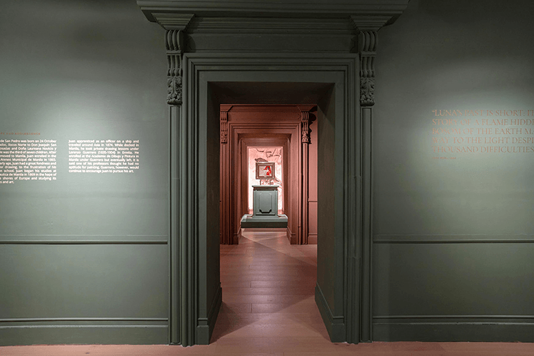
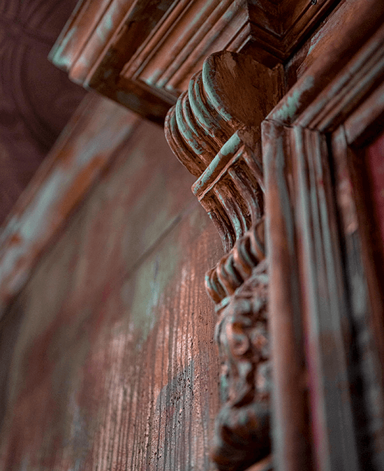
“We painted the walls frantically to create a very spontaneous-looking, unstudied effect. I wanted it done the way we do it in the theater, with layers of colors and textures rather than a shortcut version of ‘blended’ brush strokes. Beneath the dominant colors of the walls were the complementary colors. For instance, one wall had a turquoise base, but we only see it as an under-painting that occasionally shows through the roughly applied layers.”
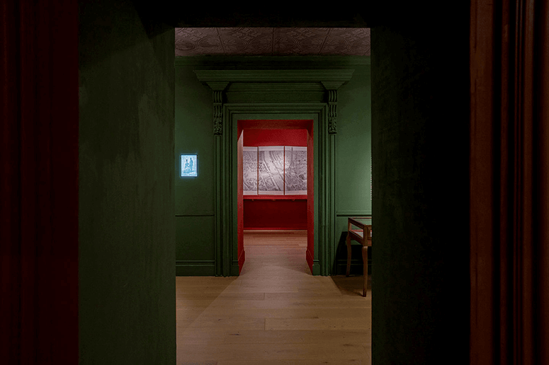
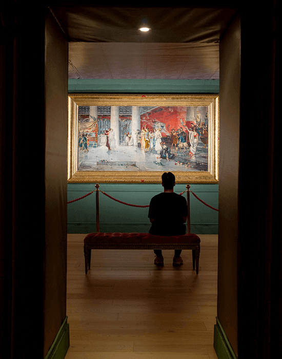
For the most important room that featured the long-lost masterpiece, Gino says he took a different approach. “Great works of art can stand alone regardless of context. But it's also beneficial for audiences to see how it might have looked in a space during its time. It helps you also understand why it elicited such a reaction back then. Therefore, I wanted to create a ‘mise-en- scène,’ or a stage setting around it. I approached the exhibition as theater and ‘Hymen, oh Hymenee’ was the play; and the installations were set designs that told different stories.”
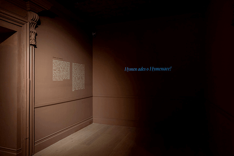
The rooms leading immediately to the painting were also kept deliberately spare. “Think of it as a palate-cleanser, to prepare you for the main course,” he says.
That special space itself was a “salon setting,” explains Gino. “I was inspired by those dark interiors with gentle illumination you get from gas lamps. Although the streets of Paris would have had electricity by then,” he muses.
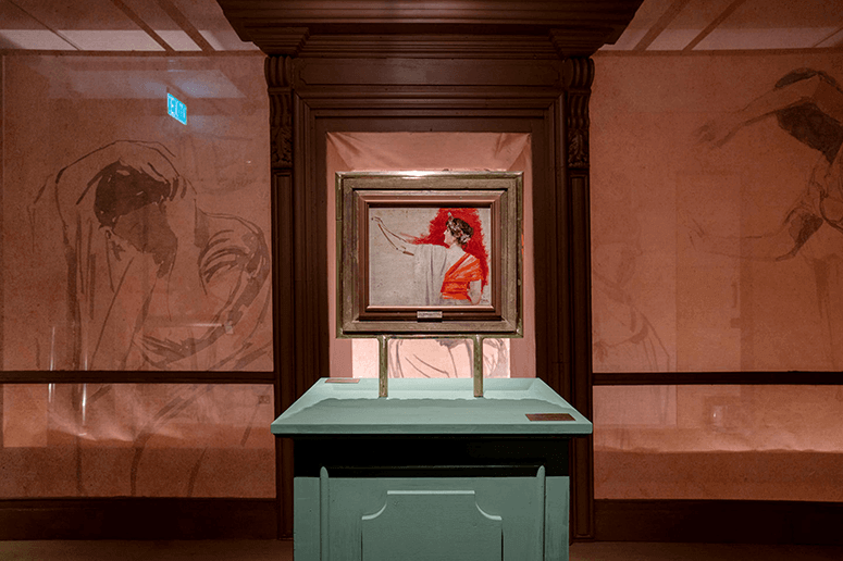
He continues, “It also benefited from Monino Duque's lighting (or absence thereof). He's one of the few people who actually understands my design language. And he immediately gets it without a lot of reasoning and coaxing from my end. He, too, is coming from a theater orientation.”
The final touch was, Gino adds, “this bench that I had done by the woodcarvers of Betis for a special wedding at San Agustin Church. I think that it was apt that it is now also used to view a wedding scene.”
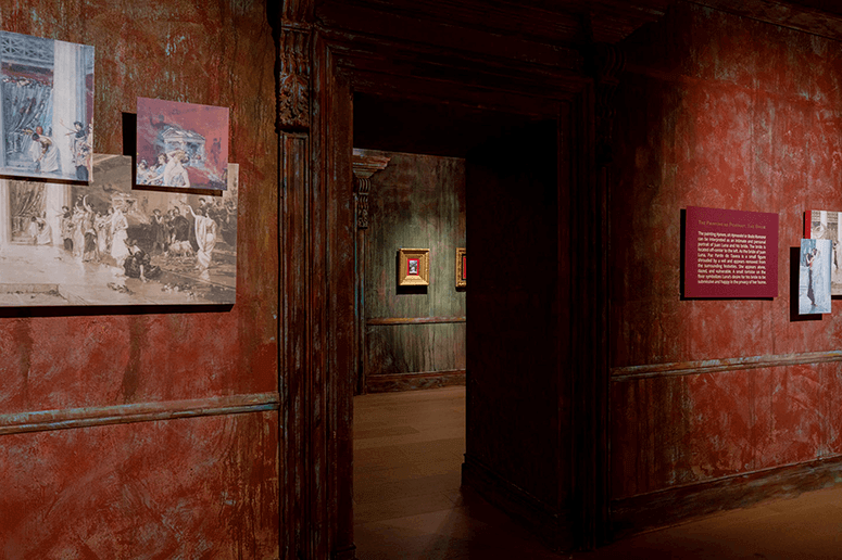
The planning of the exhibit also happened in reverse, noted Tenten. “We usually begin the process with a concept that we’d like to explore and then find the artworks that flesh it out. In this case, we began with Luna’s artwork and went on to do months of research to provide the context, building the historical narrative that would explain the importance of the canvas in Luna’s career and the promotion of Philippine talent at the end of the 19th century.
“Mind you,” she recalls with a wry grin, “when we first sat down with Gino, the first thing he asked us—and very bluntly, at that—was what did a Roman wedding have to do with the Philippines and why should Filipinos care?
“It became apparent that we needed to tackle the question of what Luna means to us today,” Tenten explains. “The subtitle of ‘Painter as Hero’ was suggested—and our colleague Jei Ente’s curatorial essay was inspired by National Artist Nick Joaquin’s foreword to Jack Pilar’s biography of the artist. And then, we added the final section of the exhibition that looks at Luna in the contemporary consciousness.”
It dovetailed with the theme of Filipino pride and the expatriate wonderment of Martin Arnaldo’s companion short film.
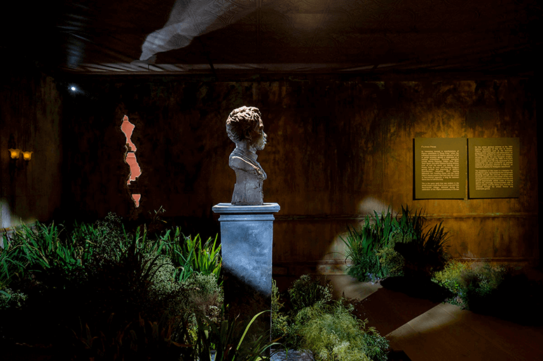
Gino continues, “The very last room was the result of creating a garden from leaves from the flower market in Dangwa, which were carefully arranged by a team of florists. They were given the very clear instruction not to make them look like floral arrangements for a dinner party,” he says with a smile.
“It summarizes everything,” he continues. “It’s a coda. We all liked the idea of Rizal’s words that ‘Genius knows no country’ seems to emerge from the wall, with Monino Duque's light bouncing off from the sheen of the gold and casting a shadow of Luna's bust. It's really theater.”
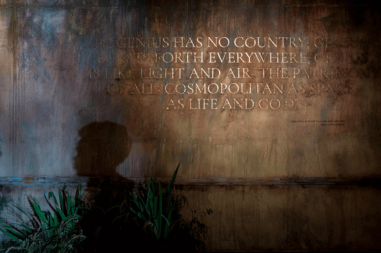
“Indeed,” notes fellow-curator Ditas Samson, “the overgrown garden symbolizes Luna’s achievements as breaking points in the crumbling structure of the Spanish colonial regime and the upcoming Filipino nationhood bursting free at the end of the 19th century.”
It was the perfect touchstone for the exhibit that opened on the 125th anniversary of Philippine independence.
"At the end of the day,” Gino Gonzales emphasizes, “I really think that aside from stimulating thought, exhibit spaces need to stir up the emotions of the viewers; and I hope—by seeing the Philippines and the world through Juan Luna’s eyes—that we have opened dialogues and conversations not just about art, or history, but also love of country in the same way he did.”


