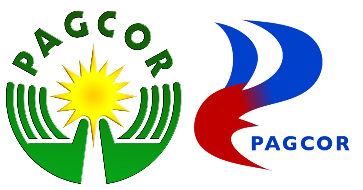
LOOK: Graphic artists share their own versions of the PAGCOR logo
Another week, another logo fiasco—this time it’s from the Philippine Amusement and Gaming Corporation or PAGCOR.
Two things readily stand out: how the upper half looks exactly like the Petron logo; and how the entire thing looks like the silhouette of the devil, mainly because of the red color of the lower half (choose your fighter—Hellboy, Loki, or Maleficent on gasoline). In short, it looks like the spawn of Petron and Satan.
Less conspicuous for non-creative eyes but egregious for graphic designers is the gradient between the two elements, a style considered by many to be a no-no or at least very old.
The new logo marks PAGCOR’s 40th anniversary. It’s 10 years younger than the Department of Tourism whose 50th anniversary served as the occasion for the launch of its own rebranding. While the DOT has explained the main reason for the slogan change from “It’s More Fun in the Philippines” to “Love the Philippines” (something about “fun” not being mentioned much as a Philippine attribute in research studies), PAGCOR has only given the rationale for the new logo.
“The new PAGCOR logo incorporates the element of fire associated with energy, inspiration, passion, and transformation,” PAGCOR Chairman and CEO Alejandro Tengco said. “It symbolizes the flame that ignites change and drives progress. The logo likewise reflects a beacon, which symbolizes guidance, leadership, and direction. It represents a guiding light that helps people find their way.”
It’s unclear if this is from the brief provided to the logo designer or if the flame originated from the designer himself and the explanation came with the proposal.

Almost instantly following the launch, social media was flooded with playful, satirical versions of the much-derided redesign including artworks done through AI (artificial intelligence). Alongside these “fun” shots are more serious stabs from other graphic designers, most of whom used the flame concept and rationale as basis for their own creations.
Here are some of the best from the unofficial #PagcorLogoChallenge online.
Kristoffer Panes' artwork is a winner on all fronts. It’s a stylish rendition of the letter P in the shape of a flame with the right colors. It also captures the rather soft, warm, sunny persona that the rationale paints. The logo itself looks fully integrated into the entire PAGCOR name but can also stand on its own. Most notably, it incorporates a key element missing in the original redesign: the gaming and amusement part.
While Sam Jhon Emperoso's take also incorporates the gaming and amusement aspect into the design, it does even more by retaining elements from the old logo. The result is something familiar and fresh at the same time. Most notably, it cleverly highlights the Philippine part of PAGCOR by looking like a stylized rendition of the flag, albeit one without the three stars.
Another strong design using colors of the Philippine flag but with graphic elements markedly tied to the gaming industry as well as the social dimension of PAGCOR’s work is that of @_jmblb on Twitter. The blue circle and the stars represent the chips and coins and the jackpot visuals in heavy use in casinos, while the red visual stands for a gamer’s hand that ultimately provides help and care for the underprivileged that are the agency’s beneficiaries.
Their brief was okay, the intention was there. But the execution of the logo design was far off from the price tag, and its close resemblance to a gas company's logo mark is very recognizable, at a first glance.
— Jei (@_jmblb) July 12, 2023
These are 3 logo redesigns I was able to come up with for PAGCOR. pic.twitter.com/7VbpKVS6Ow
User @jmvillacarl0s' design is what an “enhanced” logo looks like: not a reinvention but a better rendition of the old logo using the Philippine colors. It’s a fix to something that’s not really broken, making it more eye-catching and vibrant to capture the excitement of the industry PAGCOR is in.
Random PAGCOR logo ideas I made now that the actual logo is trending ? pic.twitter.com/kzthlvZBgy
— JVC (@jmvillacarl0s) July 12, 2023
Even more colorful, dynamic, and Filipino than the previous designs is Ren Corporal's (@RENderred on Twitter) work. The other strength of this logo is how adaptable it is: it can stand for the letter P in one iteration and another image (in this particular example, a loop of amusement, fund-raising, and developmental work) in another rendition.
Okay, so here's my take of the design of the PAGCOR's new logo. Haha! Tweaked a little color and added some more elements to make the design more patriotic and symbolic but still staying close to the concept they had. Hihi. Options are up PAGCOR! Nyaha. pic.twitter.com/5KzxE9ZULN
— Ren Corporal ✨ (@RENderred) July 12, 2023
Jay Heartwing (@JayHeartwing on Twitter) offers a better, softer, warmer rendition of the P-flame concept. The red graphic can also stand for a silhouette of a dove to signify the hope that PAGCOR’s social work provides to its beneficiaries.
I attempted to fix the new #PAGCOR logo pic.twitter.com/MRYwgBsz0E
— Jay Heartwing (@JayHeartwing) July 12, 2023
Here, the flame is readily apparent, the P less so and it’s actually what makes Kyle Francis Chua's (@kc_logos on Twitter) take, logo clever and somewhat subtle. The addition of the sun element is a neat reference to the old logo.
Different take on the PAGCOR logo#logodesign #PAGCOR pic.twitter.com/Bsnd5JQ0Z4
— Kyle Francis Chua (@kc_logos) July 12, 2023
Which brings us to the question also raised with the DOT rebranding: If it ain't broke, why fix it? And at such a high cost (P3 million) at that?!


