Very Peri is the color for a transformative year
Without mentioning the dreaded “P” word of what the world has been through the past two years, Pantone has actually responded accordingly to the times by making unprecedented choices: for 2021, it chose two colors for the first time since it started choosing the Pantone Color of the Year in 2000: Ultimate Gray and Illuminating Yellow, meant to signify the light at the end of the tunnel after 2020.
2022 marks another milestone for Pantone since it’s the very first time that they have created a brand-new color to be honored: Very Peri, blending the faithfulness and constancy of blue with the energy and excitement of red.
“Creating a new color reflects the global innovation and transformation taking place, as society continues to recognize color as a critical form of communication and as a way to express and affect ideas and emotions and engage and connect,” says company vice president Laurie Pressman. “The complexity of this new red-violet-infused blue hue highlights the expansive possibilities that lie before us.”
During these transformative times, our notions and standards are changing, with our physical and digital lives merging in new ways. We’re stretching the limits of reality through digital design, opening the door to a dynamic virtual world where we can explore and create new alternatives.
“With trends in gaming, the expanding popularity of the metaverse and rising community in the digital space, Very Peri illustrates the fusion of modern life and how color trends in the digital world are being manifested in the physical world and vice versa,” shares Pressman.
The color is used in the high-contrast tones popular with Gen Z but is also prevalent in the natural world with lavender, lilac, and periwinkle as plants that provide calm and wellness.
It actually evokes memories and everlasting love, aiding us in relationships with an unconditional form of support.
It definitely augurs a fresh start for the new year: It’s a blend that’s perfect for mending and healing, “a dreamy, calm balm for the whirlwind of confusion the past two years have been,” according to Color Magic practitioner Sarah Potter. “It’s such a pleasing color to look at, and invokes a lovely sense of peace and happiness.”
It actually evokes memories and everlasting love, aiding us in relationships with an unconditional form of support. At the same time, Very Peri is an inspiring, motivational color that can “provide us with the confidence to reach deep within, aligning our goals with our emotions,” Potter adds. It can actually open us up to “fantasy guided by our intuitions,” encouraging creativity and imaginative expression during this transition that we’re going through.
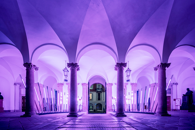
Very Peri interiors
With neutral shades dominating many homes for the past seasons, Very Peri gives a shot of playful freshness that can be introduced in walls, curtains, accent furniture, lighting, and decor. It can also be an intriguing and eye-catching accent in the pattern of wallpaper, upholstery, and furnishings.
Touches of this color can have an overall calming, optimistic, and positive effect on the human mind. It also has a dynamic influence with its whimsicality lending itself to unpredictable color combinations and spontaneous color statements.


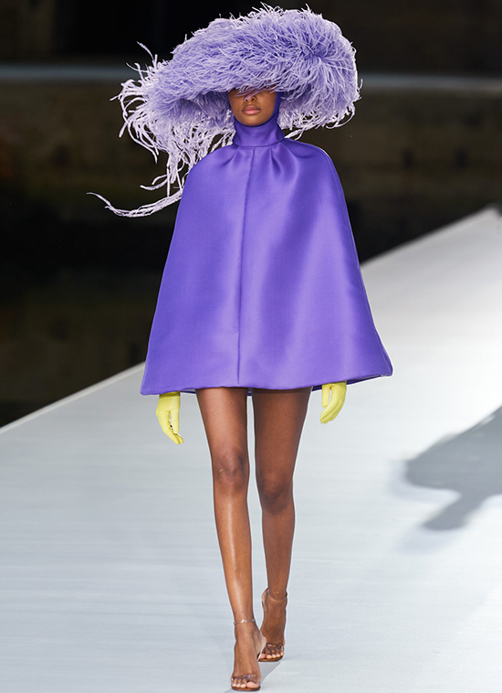
Very Peri fashion
Warm and friendly and at the same time carefree, confident, and joyful, Very Peri encourages uninhibited expression and experimentation.
No wonder many designers have adopted it in their collections, seeing how it facilitates surprising color harmonies and conveys a futuristic vibe when applied to shimmery metallics, lustrous sheens, and high-tech materials, as well as handcrafted looks and natural fibers.


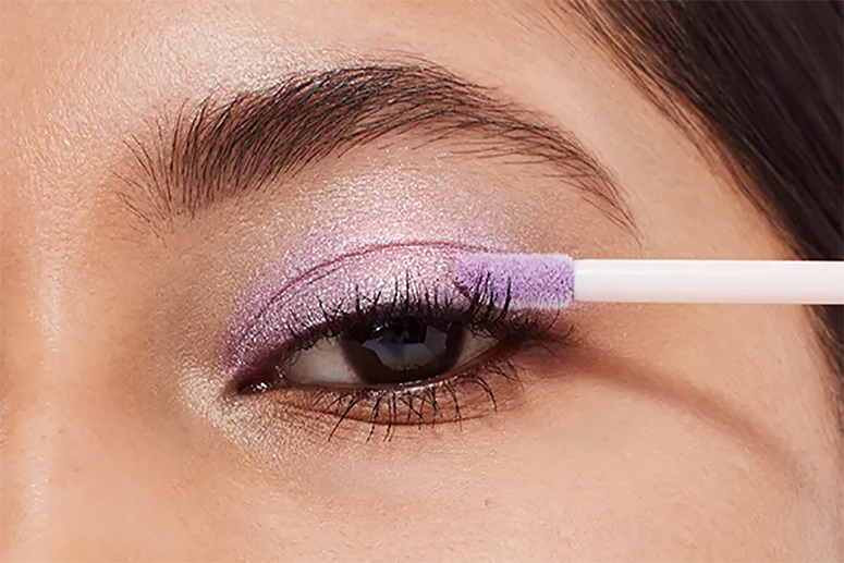
Very Peri beauty
Expressing personal inventiveness and daring imagination, the color of the year makes a novel statement for eyes, nails, and hair in a variety of finishes and applications, from dusty matte to glittery and glam.


Very Peri packaging and multimedia
Conveying both credibility and creativity, whether in a digital or physical realm, “it exudes a warmth that quickly engages the eye, making it an ideal shade for many applications of graphic and multimedia design as well as packaging,” according to Pantone.