#YSPortfolio: Adrian Panadero brings distinct Filipino imagery to new heights
Adrian Panadero’s work needs no introduction.
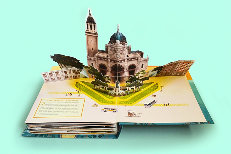
From luggage covers of creative Philippine maps to a cut-and-build paper model book of Intramuros, you’ve most likely seen some of his art already — even his late-entry to the online world’s #SigawDarna (a call for creatives to share their own take on Darna), where he depicts the iconic Filipina superhero in the style of colonial Catholic imagery, has made its well-deserved rounds.
He has also won the 2019 Philippine Board on Books for Young People- Alcala Prize for his take on A Delicate Strength: The Story and Art of Araceli Limcaco Dans by Gabriela Lee, a creative nonfiction about painter Araceli Dans and how art helped her, and the country, during the war.
A graduate of the Visual Communication program in the University of the Philippines, Adrian’s also a graphic designer at And A Half Branding and Graphic Design.
I think that telling stories through illustration is a way to pose a question, prompt a discussion, or pique interest in our story as a people. Particular themes that interest me are the Spanish colonial period, geography, and Philippine costumes and dresses.
We talked to Adrian over email about his inspiration for his art, and his favorite pieces.
Young STAR: How would you describe your art style?
Adrian Panadero: I don’t think I have a singular, solid art style just yet since it’s still evolving. However, I think there are a few qualities common to all of my illustration work. I gravitate towards graceful forms — like soft petals on a flower, subtle drapes on a dress, or even the glyphs of a custom font — but offset with something bold and rigid, like a bright yellow background or a geometric composition.
I also use texture, pastel-like strokes, and lively colors a lot. There’s also a bit of a play on realism in my work. I tend to keep the proportions of my illustrations close to real life, but I play with their composition, color, and lines.

Where do you get inspiration from?
A lot of my work is inspired by Philippine history and culture. I take inspiration from stories or elements from our heritage that fascinate me.
I think that telling stories through illustration is a way to pose a question, prompt a discussion, or pique interest in our story as a people. Particular themes that interest me are the Spanish colonial period, geography, and Philippine costumes and dresses.
I think I also got a lot of influences from the things I grew up with when I was little. I had a lot of atlases when I was a kid, so I always like illustrating maps.
I also grew up in a Catholic family, so I’m very fascinated with the pageantry of processions and Holy Week. I enjoyed looking at fairy tale illustrations too, so I think that’s where I got my inclination towards graceful forms. These are things which, I think, helped me mold the style that I have now.
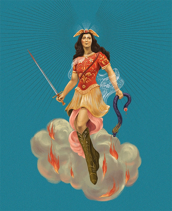
Santa Darna
I really like intersecting different references in one illustration. I think this helps us see those references in a different light.
In this case, Darna has always been seen as a hero to defeat a villain (like Valentina, a medusa-like character), not unlike St. Michael the Archangel, who’s usually depicted as slaying a dragon in Catholic artwork.
The pageantry and drama of the Catholic church has always fascinated me, and now it’s a common theme in my work.
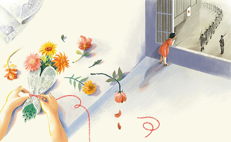
A Delicate Strength
This illustration was my winning entry to the 2019 Alcala Prize for illustrators. We were asked to illustrate a story on Araceli Dans, the prolific Filipina painter known for her paintings of embroidered fabric or calados.
This particular illustration was for a spread talking about how the Japanese invasion cast a dark cloud on the young Araceli’s childhood, forcing them to close a flower shop they operated in Manila. The wilting flowers also represented the darkness that was to come in her life with the invasion of the Japanese.
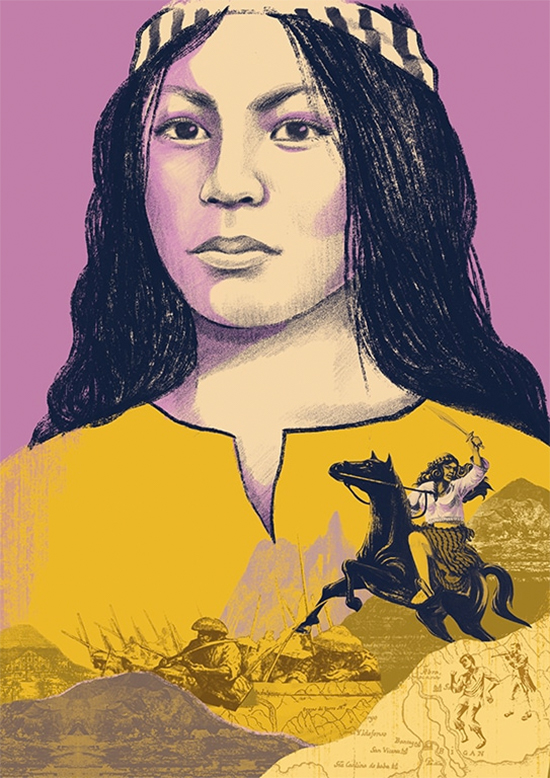
Great Lives – Gabriela Silang
This is a cover of a book that belongs to an upcoming series of biographies of different Filipino Heroes. This particular cover is of Gabriela Silang. I really enjoy researching for my illustration work, and I like getting lost in references and historical documents.
This was particularly enjoyable since there wasn’t a lot of documentation on how Gabriela Silang looked like (there are no photos of her, since cameras weren’t invented yet during her time). I had to piece together different accounts, illustrations, and assumptions to create a portrait of her.
Also, the publisher of the book series wanted a fresh approach to the covers, so we thought of doing a collage of archival material to go with the portrait. I also rendered them in bright colors to really make the covers interesting and different.
What’s next for you?
It should be a pretty eventful year for me this year, since I have a few book projects lined up. These projects mean a lot to me personally, so I’m very excited to work on them. I’m also curious to see where my career is headed to this year. Right now, the work lined up for me makes the path quite clear, but I also want to take this year to explore and grow my creativity.


